[24]7.ai · 2014–2016 · Design systems
From weeks to days: a design system for chat deployments
[24]7 put chat on the websites of some of the biggest brands in the world. Each deployment was designed from scratch by a different person. I built the standard that turned that into a repeatable job: a configuration guide, templates and training that cut design time to about three days.
- Role
- Design lead. Researched the existing workflow, defined the standard, wrote the documentation, built the templates, trained the team
- Users
- Service Delivery designers, mostly in India, who configured chat for each client
- Scope
- Desktop and mobile chat: invitation, docked button, pre-chat, chat, agent transfer, push content, errors, post-chat
The problem
Every chat deployment was treated as a custom design. Brand, layout, copy and states were decided from scratch each time, and review cycles with the client ran long. A deployment that should have taken days took weeks, and quality depended on who happened to pick it up.
The company wanted solutions deployed faster so revenue could start sooner. The package was framed as a 48-hour proof of concept, and the design step could not be the thing that missed it.
Approach
I started by sitting with the Service Delivery team in India and watching how they worked today: where the time went, which decisions they re-made every time, and which the client cared about. Then I worked with product, engineering and account teams to agree what should be fixed and what should be configurable.
The answer was a "Standard" package. The chat interface is fixed. A designer configures a short, strictly limited list of options, and nothing else may be changed. Anything beyond that moves to a separate Enterprise engagement with its own scope and price.
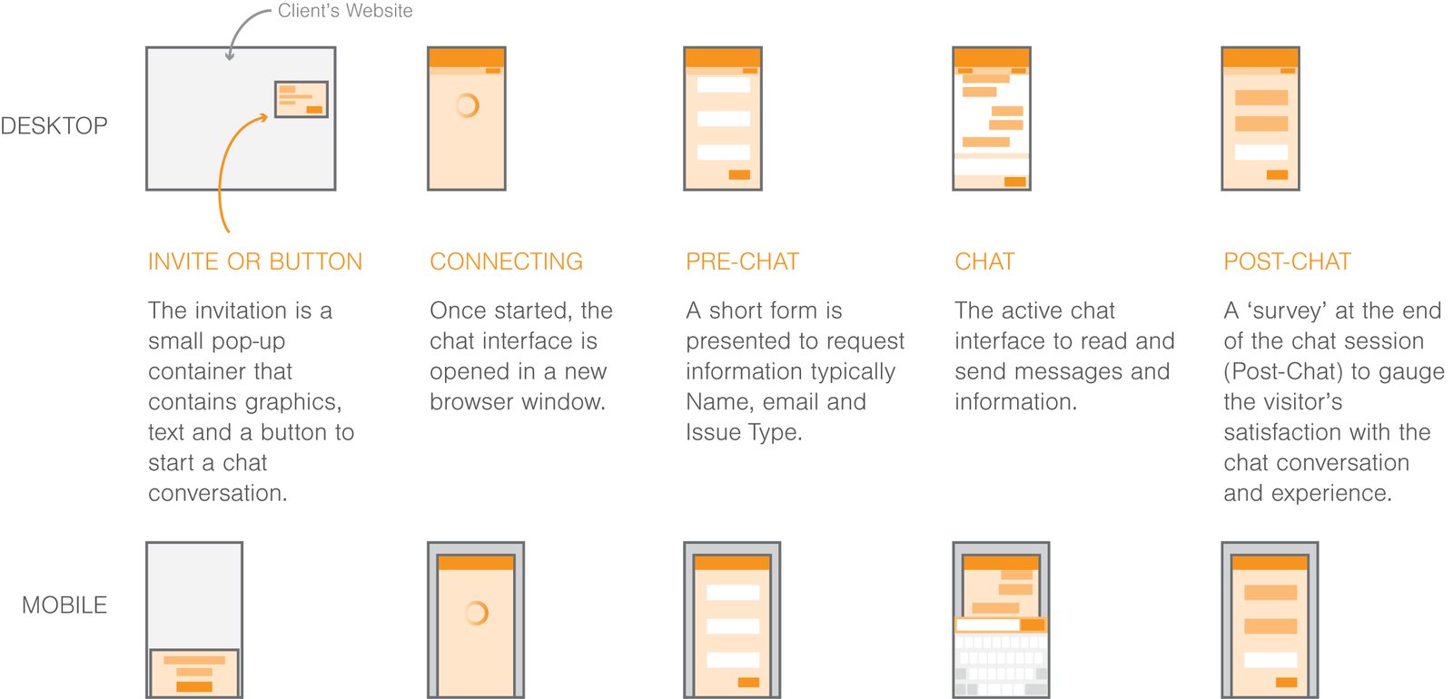
What was configurable
Deciding what to leave out was most of the design work.
- Brand: one logo and two colors. Color 1 goes on the header. Color 2 goes on buttons and controls. That is enough for the interface to feel like the client's own.
- Invitation: a choice of three layouts, one for square or tall logos, one for wide logos and one for vertical page layouts. Two lines of text with character limits, so copy always fits.
- Pre-chat: any combination of name, email and an issue-type menu, with a recommended maximum of five options.
- Everything else: fixed. Connecting, transfer, error, ended and post-chat states came already designed, with the client's logo and colors applied.
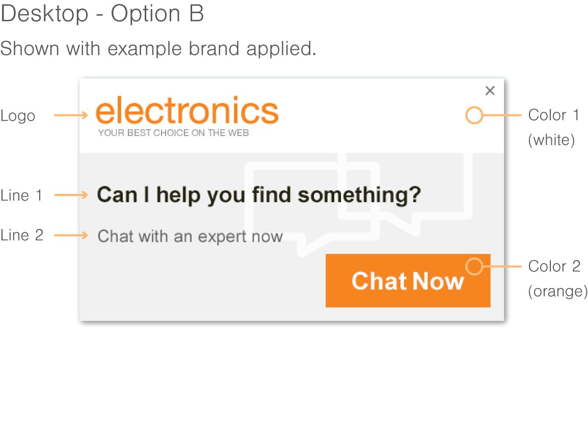
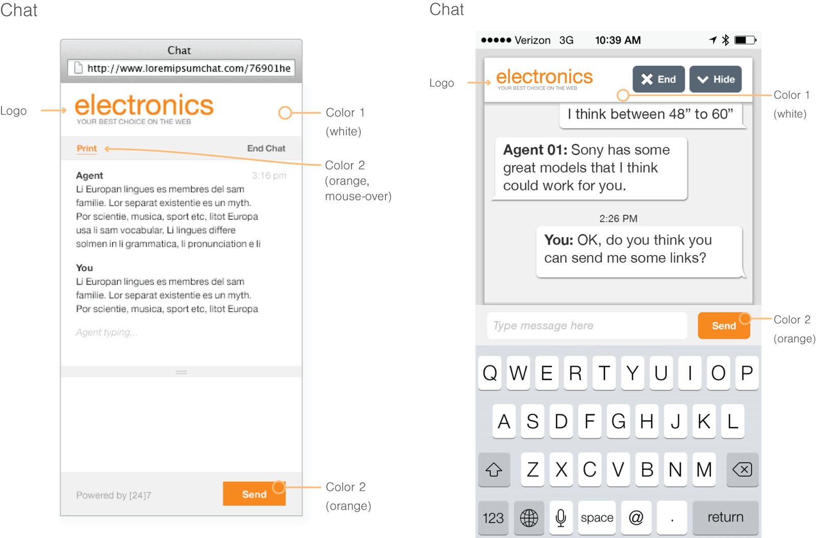
Making it usable
A standard only works if people use it. I produced three documents for different moments: a requirements checklist of what to collect from the client before starting, a configuration guide for each screen and option, and a step-by-step guide for the Photoshop templates.
The templates were built to make wrong moves hard. Layers that can't be changed in a Standard deployment were flattened or locked. The ones that can are marked green. Examples from real client brands sit inside the file so a designer can see a finished result before starting their own.
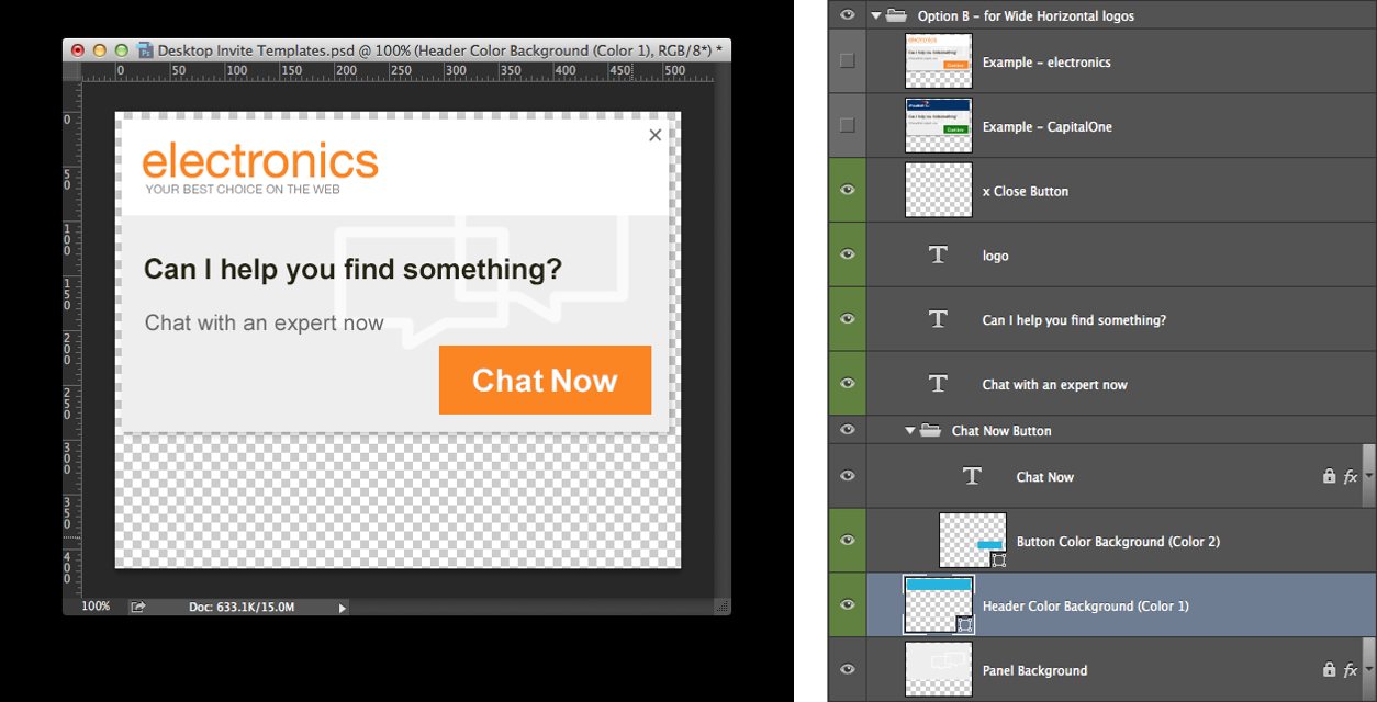
I then trained the Service Delivery designers to produce mobile, desktop and tablet chat in this systematic way.
Outcome
- Design time for a standard chat deployment dropped from weeks to about three days.
- Clients went through fewer review cycles on the designs.
- Quality became consistent across the team, and consumers responded with better conversation rates, according to the review of the work.
- The delivery team, used to one-off designs, began to think in frameworks and reusable solutions.
Later, the design studio automated the generation of client chat specifications, cutting a two to three day task to about an hour. That was a team effort that built on the standard.
Looking back
The rule I'd keep is that a design system is a decision about what not to allow. The documentation was the product, and the templates were just how people met it.
What I'd do differently: build it as components and tokens in a tool like Figma, where the constraints are enforced by the file instead of by a green layer label, and instrument review cycles from day one so the improvement is a number, not a recollection.